7 Printing Mistakes That Quietly Damage Brand Perception
Most brands weaken trust through printing choices they never realize they’re making.
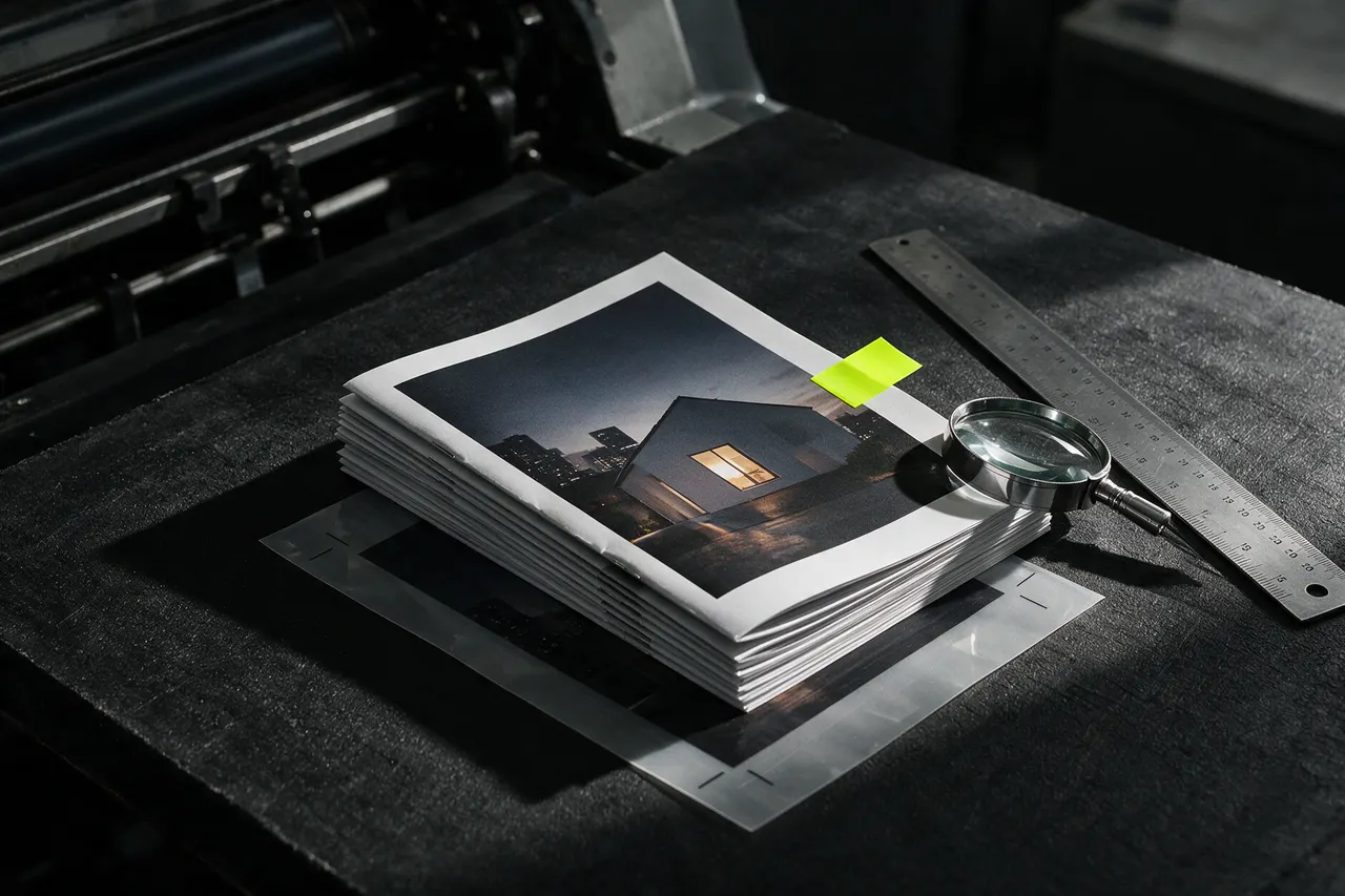
1Print is part of the first impression
A printed piece often speaks before the conversation begins. The paper, finish, colour and detail all signal how carefully a business works.
The strongest materials are not simply the most expensive ones. They are the choices that support the purpose of the piece and the promise of the brand.
2The seven details worth checking
These are quiet decisions, but they compound. A clear brief and an early production conversation can prevent most of them.
- Choosing stock only by price instead of by the impression it needs to create.
- Using type that becomes difficult to read once it is printed at final size.
- Approving colour on screen without checking a real production proof.
- Using finishes that look impressive but do not suit how the item will be handled.
- Leaving bleed, folds, die-lines or safe areas until the final artwork hand-off.
- Treating a business card as a giveaway rather than a meaningful brand touchpoint.
- Ordering a full run before testing one carefully considered sample.
3Make the material match the message
A premium service needs materials that feel assured. A fast-moving promotion needs clarity and efficiency. Neither approach is wrong when it is intentional.
Before production, ask what the recipient should notice, feel and do. Those answers make the material and finishing choices much easier.
Keep reading
- 01Materials · 2 min readWhy Heavier Paper Feels More Premium“Weight is the first thing a hand notices. What gsm really measures, why two cards of the same weight can feel different, and where the extra grams are worth paying for.”Read the article →
- 02Business essentials · 1 min readBusiness Card Mistakes That Cost You Opportunities“Why small details decide whether people remember you — or forget you.”Read the article →
- 03Production · 1 min readHow to Choose the Right Printing Partner“What smart brands look for beyond price and promises.”Read the article →